Periodical
The starting point
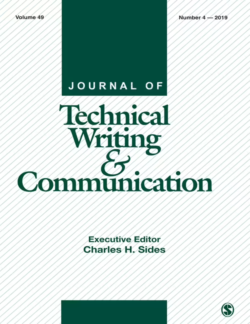
The cover that I chose to redesign in this project gave me the impression of a work that was uninspired. The design does not reflect any kind of creative thinking through the design process. All the issues have the same layout which makes it difficult to distinguish between issue and year. None of the issues have a theme on the cover, which makes it difficult to know in advance what to expect in the issue.
Drafts
In the first drafts of the design process, I experimented with different forms and expressions, and after good guidance and constructive feedback, points emerged where either the expression was too abstract or it was not a good enough semantic depiction of the magazine's content.
Continued development
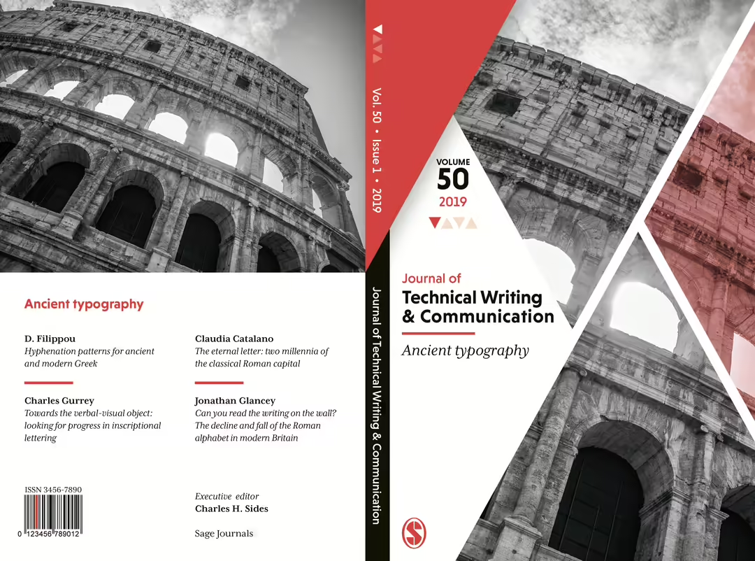
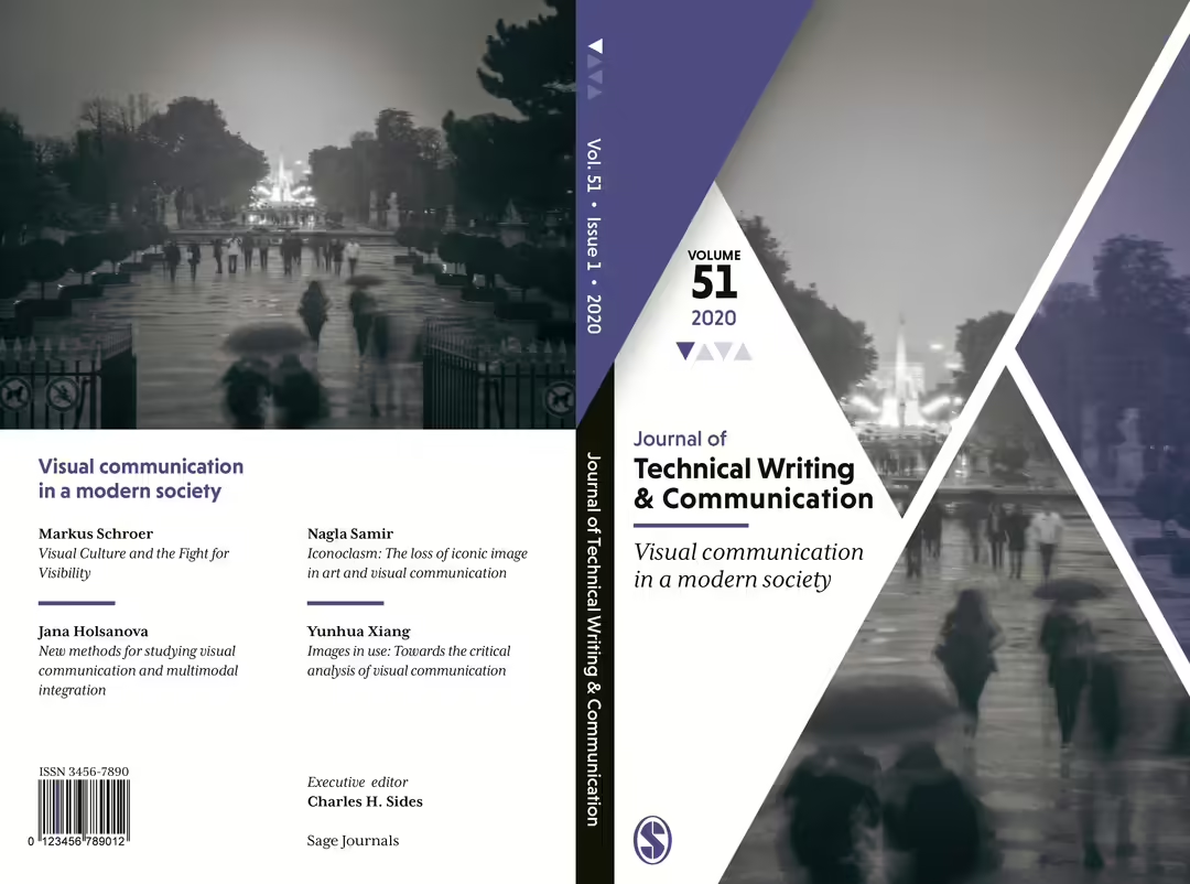
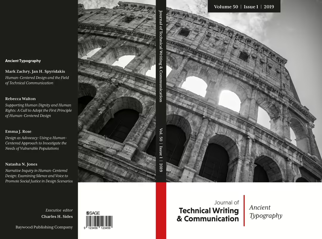
Once again, I wanted to try my hand at a completely new design. This time I wanted to try to use photography in the design. Out of personal preference, I wanted to distance myself from using stock photos in this assignment, which gave me the opportunity to use my own photographs in this context. First and foremost, the photographs had to be in gray scale so as not to stand out too much in the cover's entirety and choice of theme color. The photographs were chosen according to the theme, and were preserved in their original proportions, which opened up space on the underside where the magazine's name and title of the issue were placed. Here I also chose to place a red line according to the input design.
The result
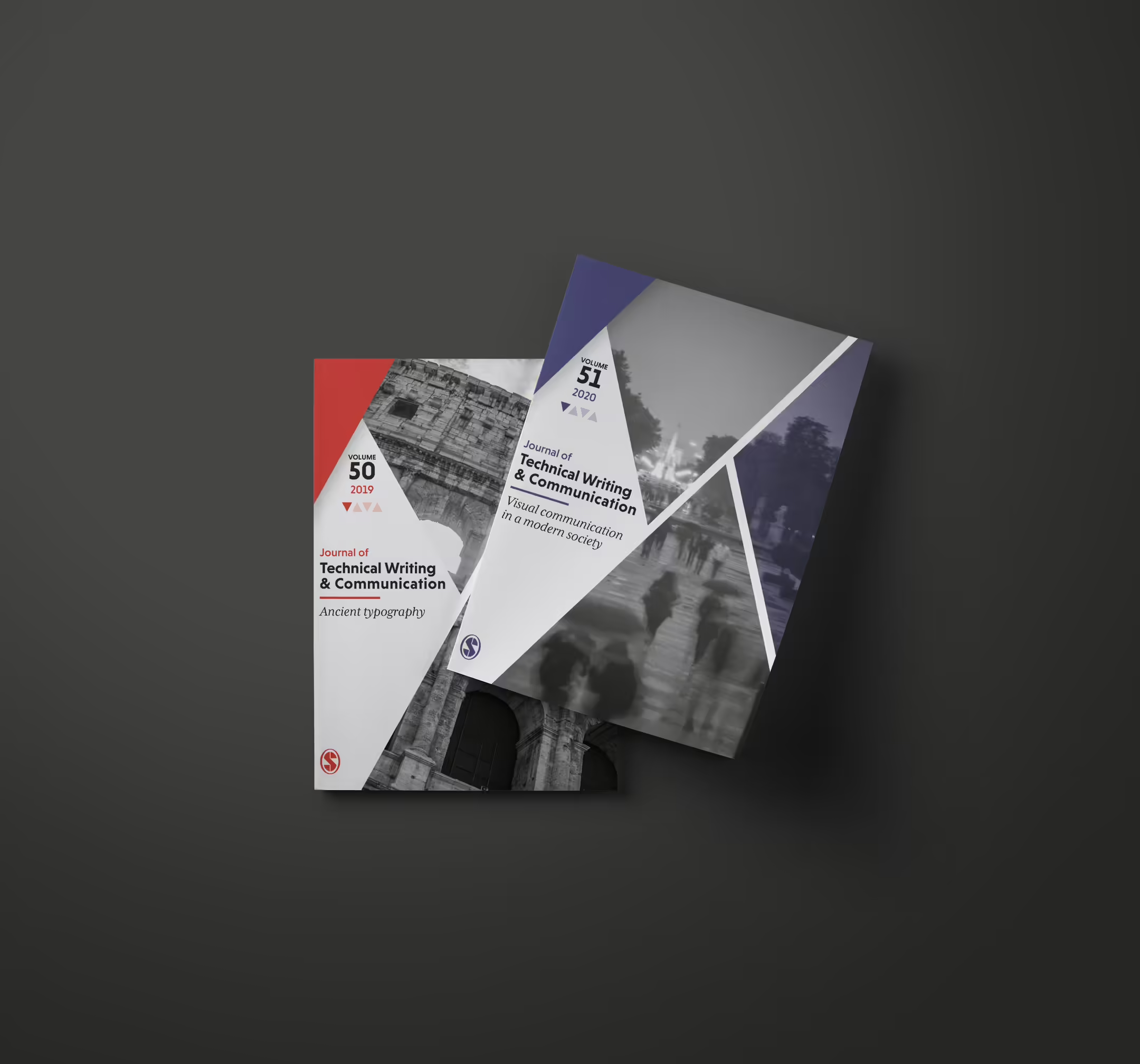
In my last and final cover, I chose to further develop the previous draft. This time, I've worked a little with the surfaces and designed the photographs in a network of geometric triangles to create a playful formal expression, which is in great contrast with the boring expression of the original cover. The same triangle shape is repeated on the top and bottom, but a different type of triangle is placed in the remaining space. Because this one stands out more from the other two triangles, I chose to color it with a hint of the theme color, with a slight transparency. The journal's meta information such as year and issue has been made clear and has been placed in air around the triangles. In this meta information there is also something I call a counter, which is essentially a form of indication of which issue in the year this publication belongs to. Using the same forms as previously mentioned, you can easily see which issue the journal belongs to by using denominations. The logo of the journal's publisher has also been placed at the bottom of the cover. In connection with the journal's name and title, no major changes have been made other than that they have been repositioned and placed vertically. On the back cover, you can view the issue's themed photographs in their correct format, and get a short and concise overview of the issue's highlighted articles. The darkest photographs have also been lightened.