Wayfinding
Idea and concept
This was a project where large parts were based on insight work. This included interviews and a physical inspection of the facility. Based on this insight, we came to the conclusion that the existing wayfinding system was temporary due to the fact that the Institute's affiliation with the facility was so new. The temporary solution consisted of yellow tape and post-it notes for wayfinding, which we felt was not a good solution.
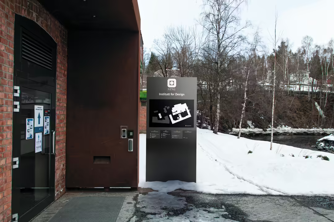
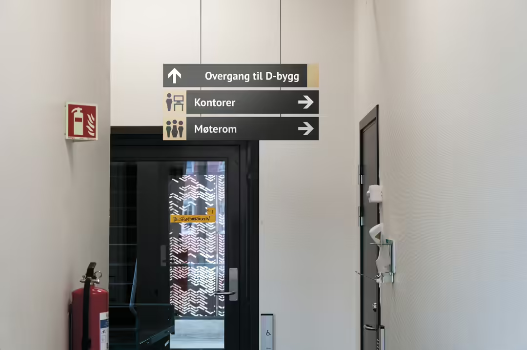
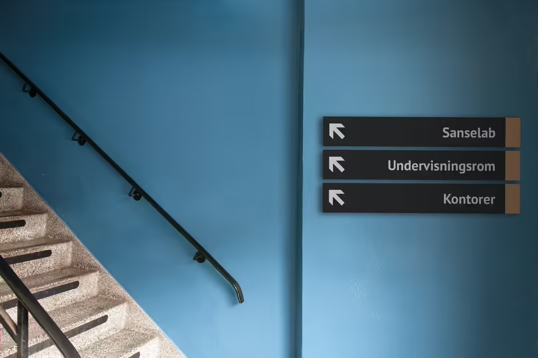
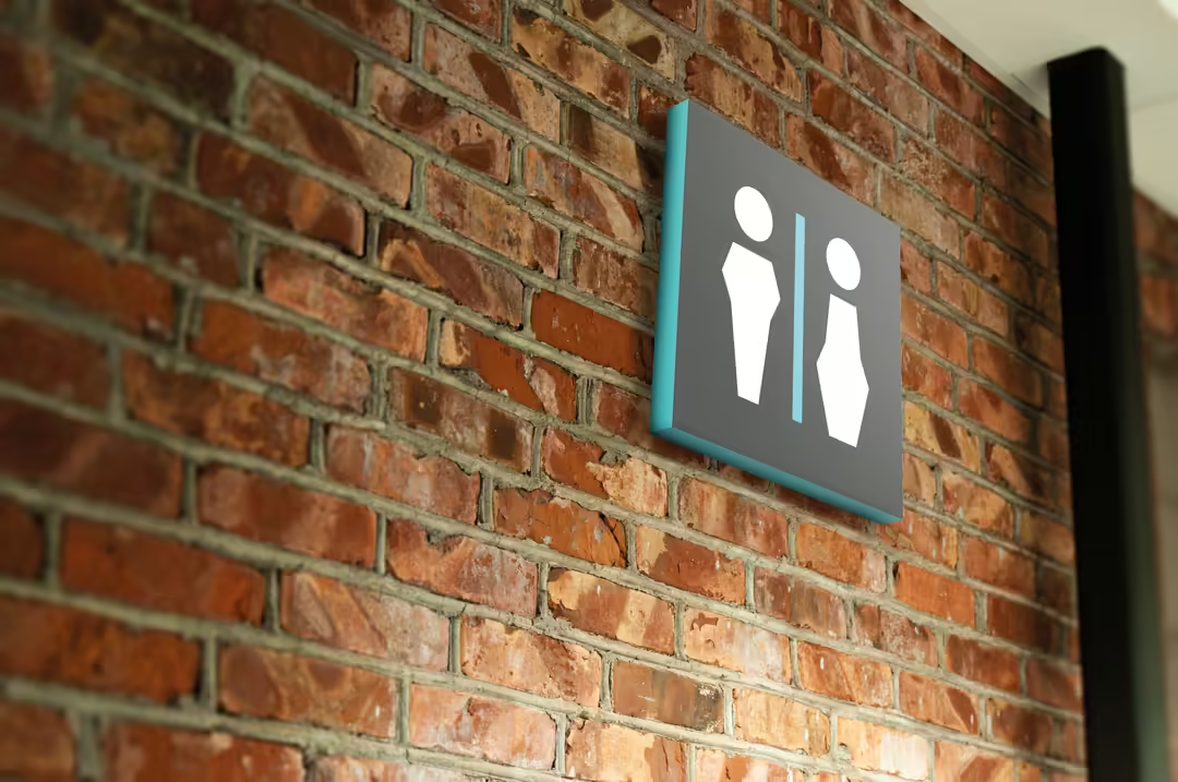
The actual wayfinding system we developed consists of signs, pylons, posters and wall decor. We also created customized pictograms with regard to universal design, and used colors according to NTNU's graphic profile.
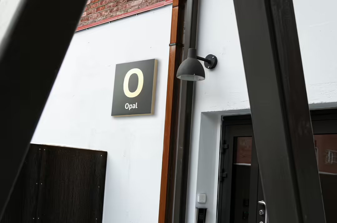
In order to continue the existing naming system used at the NTNU campus in Gjøvik, we wanted to name the buildings after rocks and minerals in this solution.
Typography
PT Sans Bold is used as the main font on all types of signs. This is a typeface that we felt was well-suited to wayfinding because it has a large x-height and a lot of space at the ends of letters such as e and s. It also has very distinctive ink traps that we believe contribute to good legibility. PT Sans Regular is used as a secondary font on signs with quantity information and on subtitles on employee signs.
Colors
Each color represents each building belonging to the facility. They are selected according to the rocks and minerals that the building represents and NTNU's supporting colors.
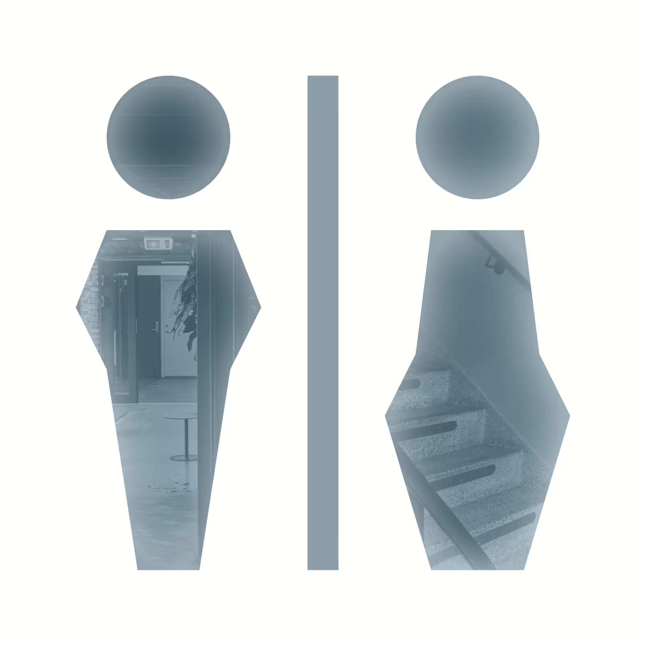
Pictograms
The pictogram set is adapted to our wayfinding system and was designed with SEGD standards in mind. The disability pictogram is inspired by The Accessible Icon Project, which strives to make everyday life easier for people with disabilities through universal desig
Building names
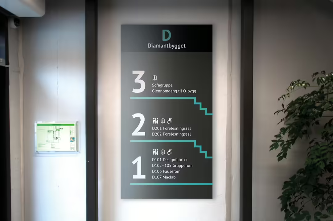
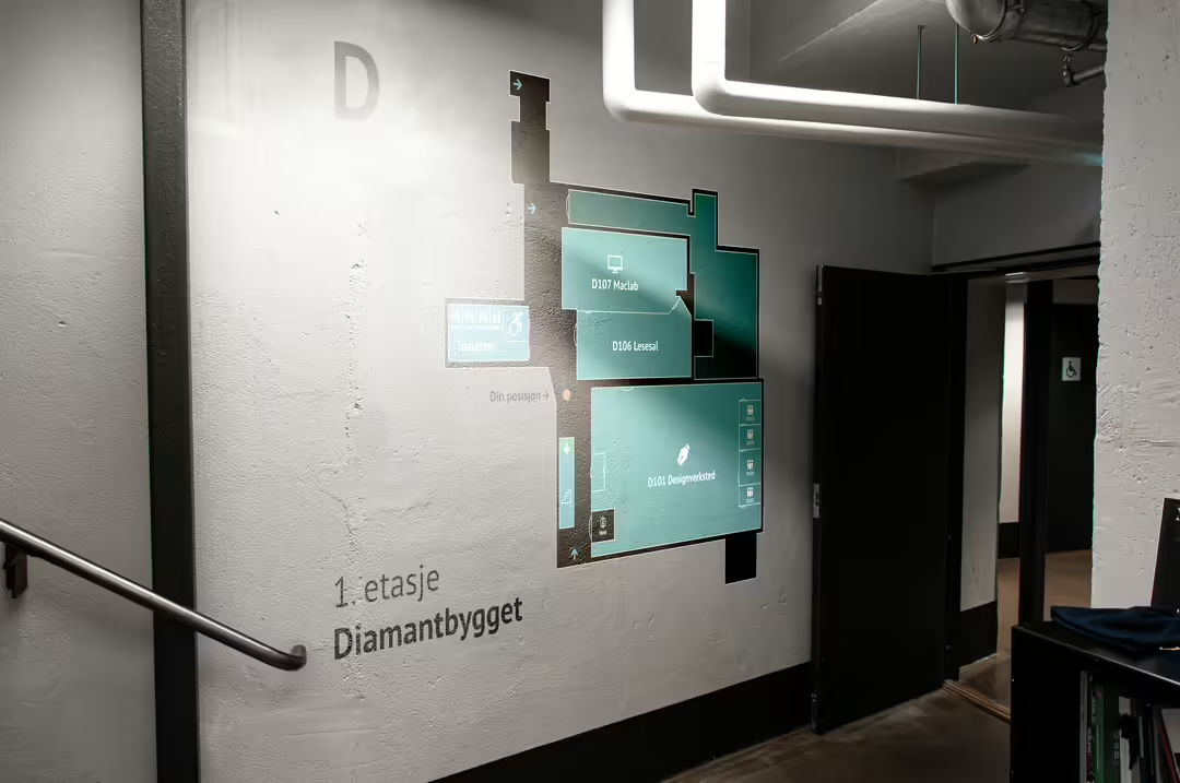
Building names can also be associated with the building's function. For example, Diamantbygget starts with D, which can be further associated with design. The same applies to Opalbygget, which has O for office. The letter does not necessarily have to be specifically based on the first letter of the business, e.g. Ilmenittbygget (where research into universal design takes place), the letter is based on important keywords that can be associated with the business, which in this case are keywords such as inclusive and intuitive.
Room names
Room names consist of a building letter, as well as numbering based on floor and the order in which the room occurs from the main entrances. Rooms will also have functional names that explain what the room is used for. The reason why we have chosen to do it this way is that it can be misleading for new visitors when proper names are used for rooms.
Example of room name: D107 Maclab, O316 Office.