Kunstsilo
Background
In this project, we have been tasked with designing a new visual identity for Sørlandets Kunstmuseum SKMU in line with their strategy and vision. The new identity will be called Kunstsilo, and when it opens in 2022 it will be a cultural center that promotes modern Nordic art that will attract visitors locally, nationally and internationally. We have therefore developed a visual identity that conveys a modern Nordic expression that will help to increase interest among both adults and young people regardless of background and where they come from.
During the work process, we conducted research into what the project is about and what visions and values Kunstsilo wants to convey. We conducted interviews to gain insight into their thoughts on the project. We also defined a target group and created personas accordingly. We carried out a visual mapping of other competitors and critically assessed them on the basis of their visual identity.
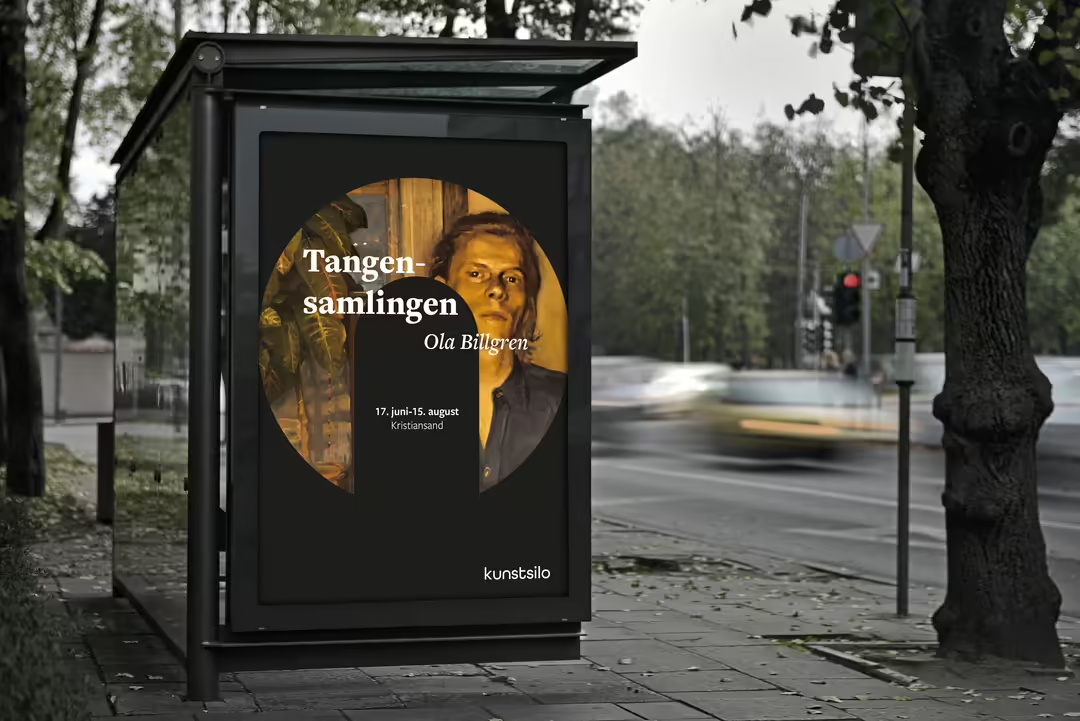
Based on the information we gathered during the background work, we worked on developing the visual identity for Kunstsilo. Through several sketching processes, iterative rehearsals and feedback on guidance, we arrived at a starting point for our identity. This included logo, typography and color palette and additional elements. We also created simple usage guidelines where we defined minimum dimensions, air requirements and logo usage guidelines. By creating contact points, we have had the opportunity to test the identity for different purposes, both in print and on screen.

Target audience
In Kunstsilo's vision statement, it was expressed that they were concerned that Kunstsilo should be attractive to diversity, both locally, nationally and internationally. Therefore, we do not want to set limits on the target group's background when defining the target group. Kunstsilo is prepared for a large proportion of its visitors to be international tourists and it is therefore important that our project facilitates this. It's also important to focus on those who are interested in art, especially modern and Nordic art, which is what the collections are known for. We need to facilitate that visitors can be individuals, families, groups and school levels. We have therefore defined our target group as individuals or groups with an interest in Nordic contemporary art, regardless of age, background and gender, as well as international tourists.

The logo
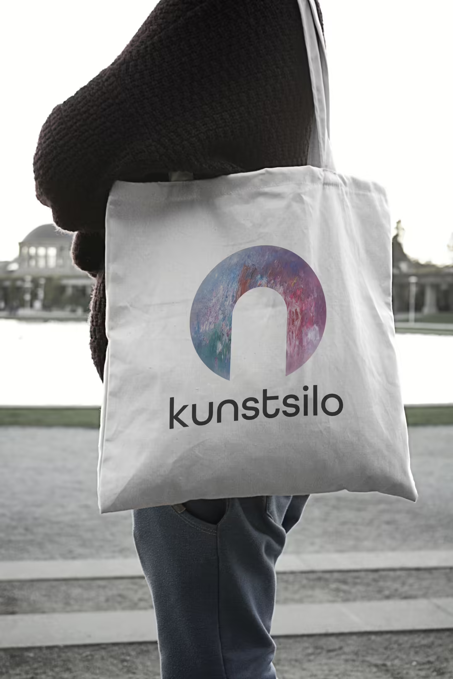
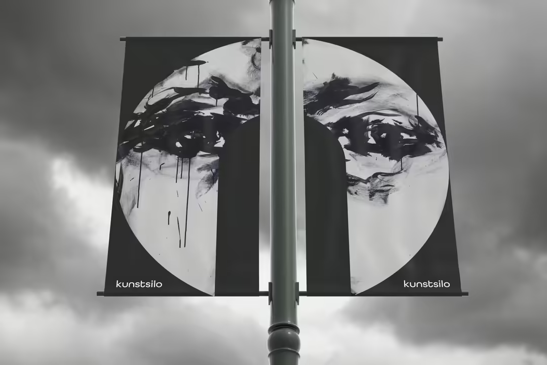
The logo symbolizes a silo in the negative space, and the circle that circles around it acts as a window into the world of the Art Silo. Through this effect, we want to communicate and give the viewer an impression and a taste of what the museum has to offer.
The recognizable circular shape reflects the shape of the silo, while at the same time making the whole look modern and minimalist. The look of the logo will vary depending on the purpose, and can use any of the colors in our color palette as long as it is in accordance with the guidelines. In cases where art is used in the logo, it is important to take into account the overall expression of the art and not “cover up” the most important elements that the artist wants to convey. The logo will therefore not be compatible with all possible works of art.
Reflection
This project has been a good starting point for learning by failing. We've gone through many iterations in our work on identity, and have also had to make major changes when we realized we were stuck. Through periodic guidance, we have received good feedback and constructive criticism that has been a good basis for the development of the identity. We've realized that creating a new visual identity in itself is a big challenge that requires a lot of work, from research and sketches to the finished product.
We have created an identity with a modern and Nordic feel that will appeal to our chosen target group. It creates attention and interest, which in turn creates good recognizability that stands out. Through our identity and logo, which acts as a window into the world of Kunstsilo, we wanted to achieve an effect where viewers question, but at the same time become curious about what Kunstsilo has to offer.

