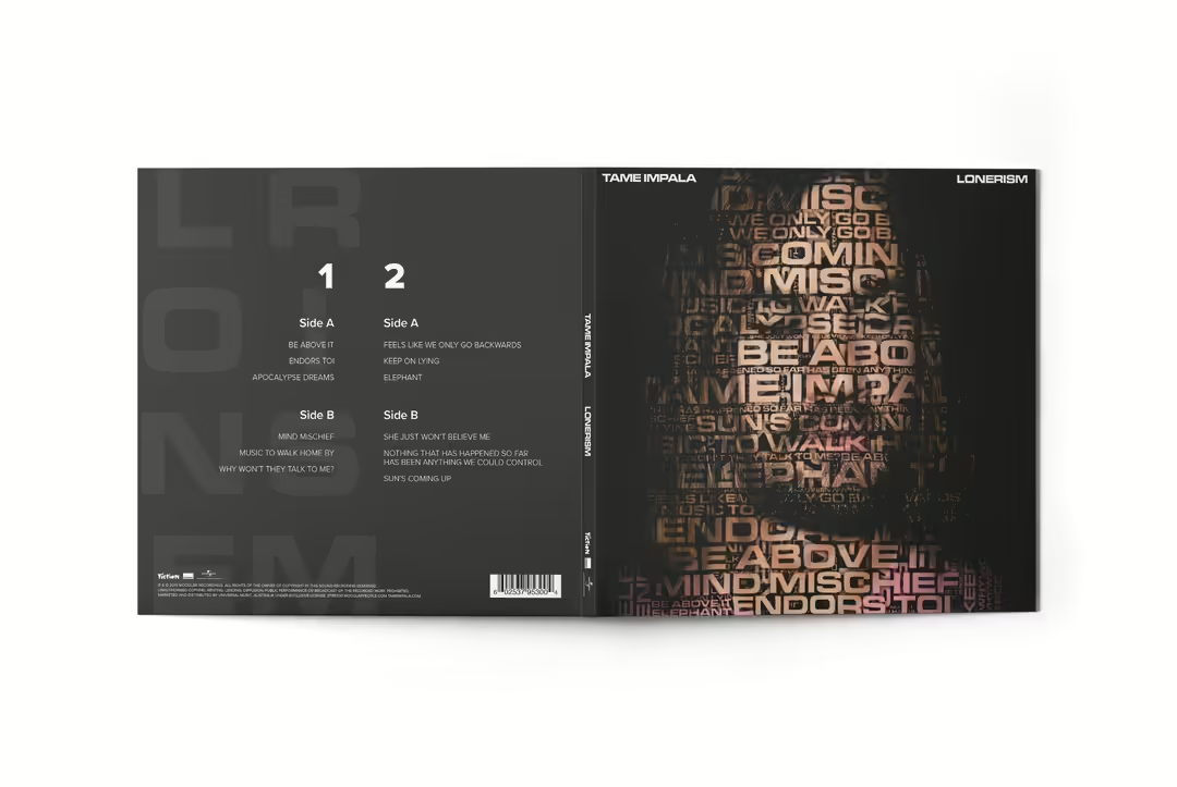
Lonerism
Idea and concept
In this project, I wanted to create a new twist on Tame Impala's previously established graphic identity. I emphasized that Tame Impala is not a group, but a musical project that only one person is behind.
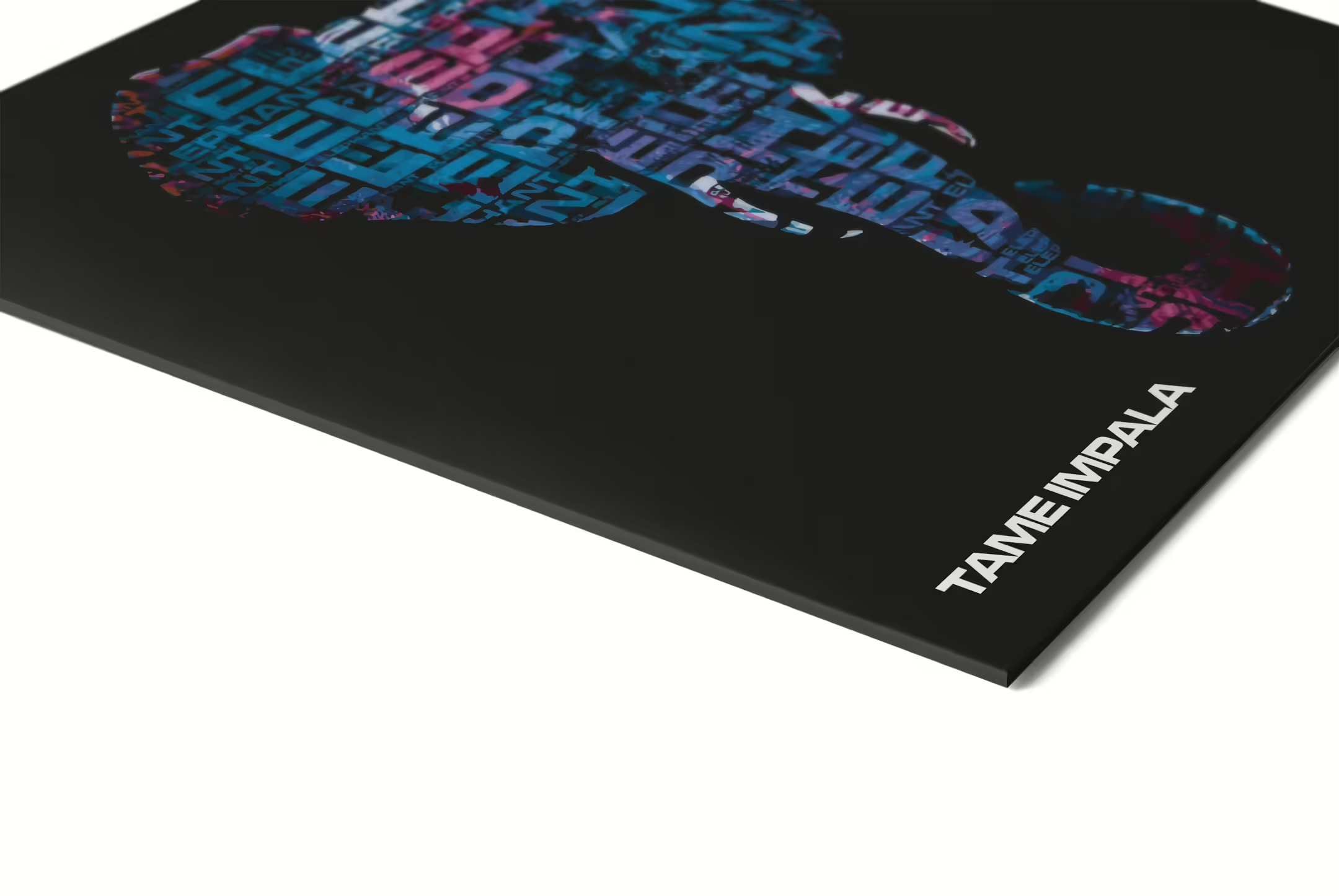
In the design of the 12” cover, I chose to present a portrait of the artist, accompanied by all the song titles in the album. This is a graphic representation where the text creates a visual image of the musical genius behind the songs.
This same graphic representation has also been used on the cover of 7”. The saturated colors in the illustration are also a tribute to the psychedelic genre that Tame Impala is known for.
The style of the project is repeated in all forms of publication to create a good coherence, and the minimalist style creates a clean layout where the viewer can focus on what I believe is essential in conveying the message.
Cover design for 12"
As mentioned in the introduction, I want to emphasize the truth behind Tame Impala, and give Kevin Parker the recognition he deserves. In order to do this, I want him to be presented on the cover, and at the same time be able to convey his musical prestige in one and the same motif.
Here I have found a image that I feel fits well with my purpose. Initially, I felt that the image was good enough on its own, but eventually I decided to make some changes. Firstly, the image had to be cropped to the right size, the background had to be removed, and some small changes had to be made to the contrast, brightness and saturation. The shirt was changed to a pink color, because the red color was too dominant.

Photoshop magic
The biggest change made was to close his eyes, a change that is the most complicated action I have done in Photoshop to date. But the result was better than expected, and although it may look a little fake, it doesn't really matter because of the next step.

Musical word cloud
Here I've put together (using the tool at wordart.com) a “word cloud” with all the song titles in the album, as well as Tame Impala centered in the middle. By masking the text above the image on the left, the result was as in the last image. The word cloud has also been distorted to fit the contours of the face. On almost all of Tame Impala's releases, their logo and album/single title have been placed at the top of the cover on opposite sides. It's a style that has been repeated several times, which is why I wanted to continue with this style on my redesign. The font used is Microgramma D Extended Bold.

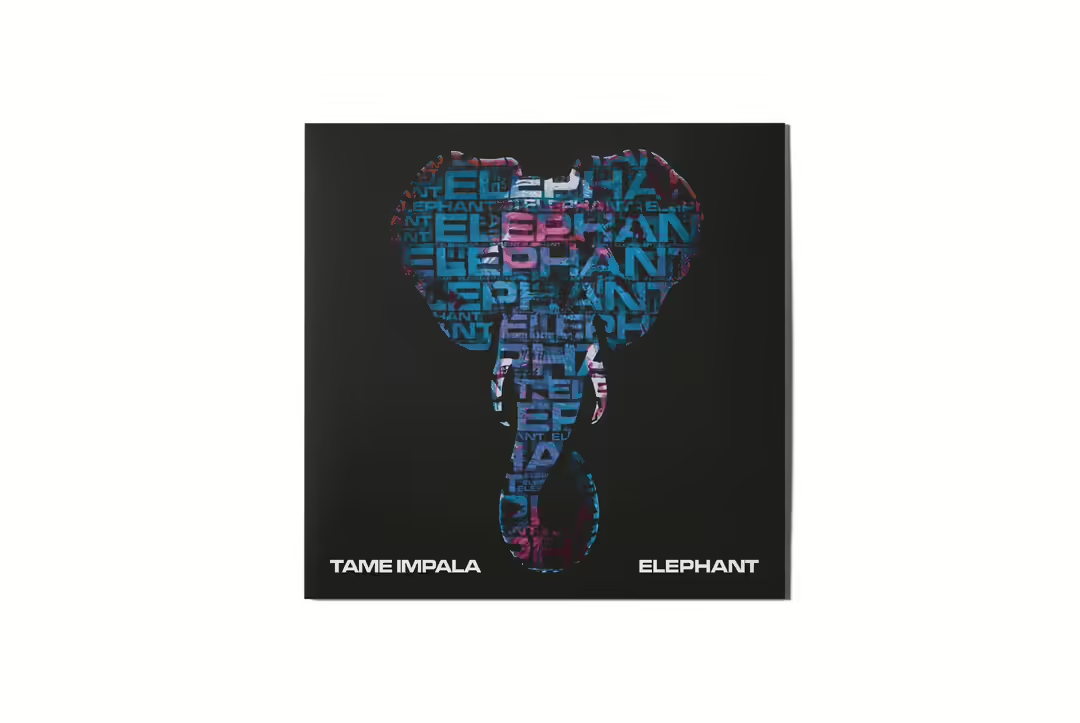
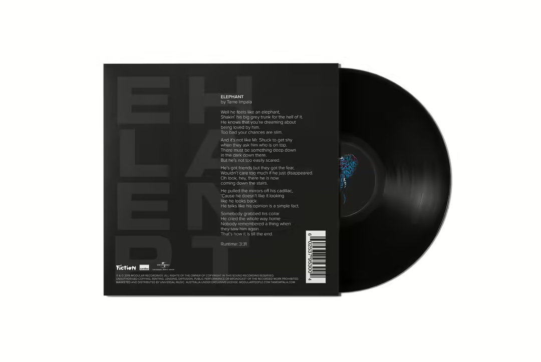
Cover design for 7"
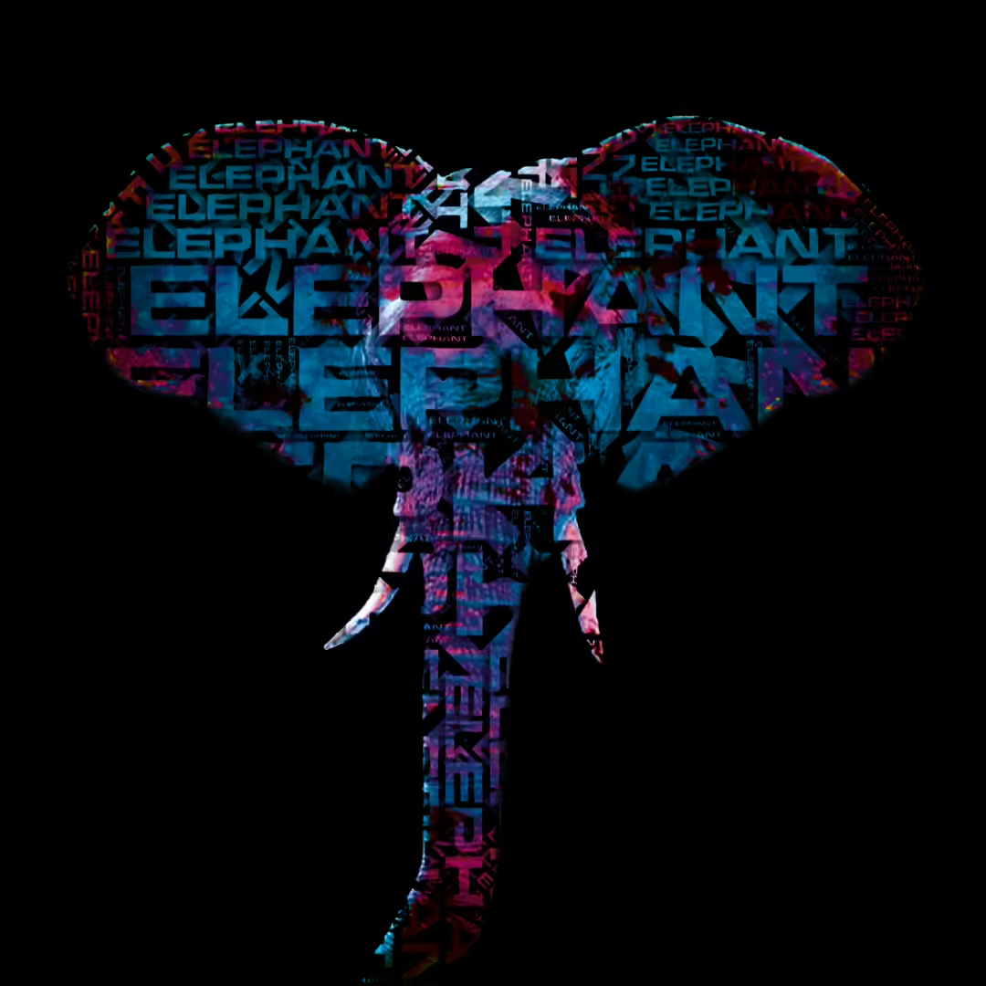
Here, I wanted to use the same style and approach as the design on the 12” to create a connection. The single I wanted to work with was Elephant, and I already had a good idea of what this illustration should look like.
I started in the same way as the 12“, with a reference image I found on the internet. Here I also had to crop the image to the right size and remove the background. The elephant itself is grey, a boring color in an album based on psychedelic music. I therefore decided to “spice up” the elephant with bright colors. In the same way as before, another word cloud was masked over, this time only the word Elephant is repeated.

Draft
The result was fine, but I feel that it can be a little difficult to make out an elephant in the illustration. So in the second draft, I decided to create a version where the elephant's body is removed from the image, leaving only its head, trunk and ears. The result was better, but this time I felt that there was too much air on the cover.
The result
I chose to revisit the design of the 7” because I was initially not completely satisfied with the result. By using a distortion tool in Photoshop, I was able to change the shape of the figure to the vector graphic presented in the graphic here.
By adjusting the overall shape of the figure, it now filled more of the gaps that occurred in the previous draft, and it got a shape that represents an elephant to a greater extent than before. The colors are also lighter in this version because the illustration tends to get quite dark after the word cloud has been masked in. The text in the word cloud has also been changed from diagonal, as in the first two drafts, to horizontal to maintain the same style from the 12” cover. Unlike the 12”, I have also used image trace in Illustrator to give the illustration a graphic feel, and to hide the stretching of the texture that occurred as a consequence of the distortion.
In summary
In short, this project is my attempt to create a new twist on Tame Impala's graphic identity. I wanted to emphasize the importance of giving credit to Kevin Parker who is the sole person behind the production of much of the music. I wanted to convey through this project that Tame Impala is not a group, but a musical project that only one person is behind. To do this, I have omitted all references that associate Tame Impala with the group Pond, with whom Kevin Parker performs at concerts where his music is played. I have also chosen to present him on the cover of the album, accompanied by all the song titles that the album has to offer. A graphic presentation where the text creates a visual image of the musical genius behind the music. This same graphic representation has been done in the cover of the single, where an elephant has been visualized with the title of the single. The saturated colors in the illustration are also a small tribute to the psychedelic music genre. The style of the project is repeated in all the publication solutions to create a good coherence, and the minimalist style creates a clean layout where the viewers can focus on what I think is essential in conveying my message.
