Libération
Idea and concept
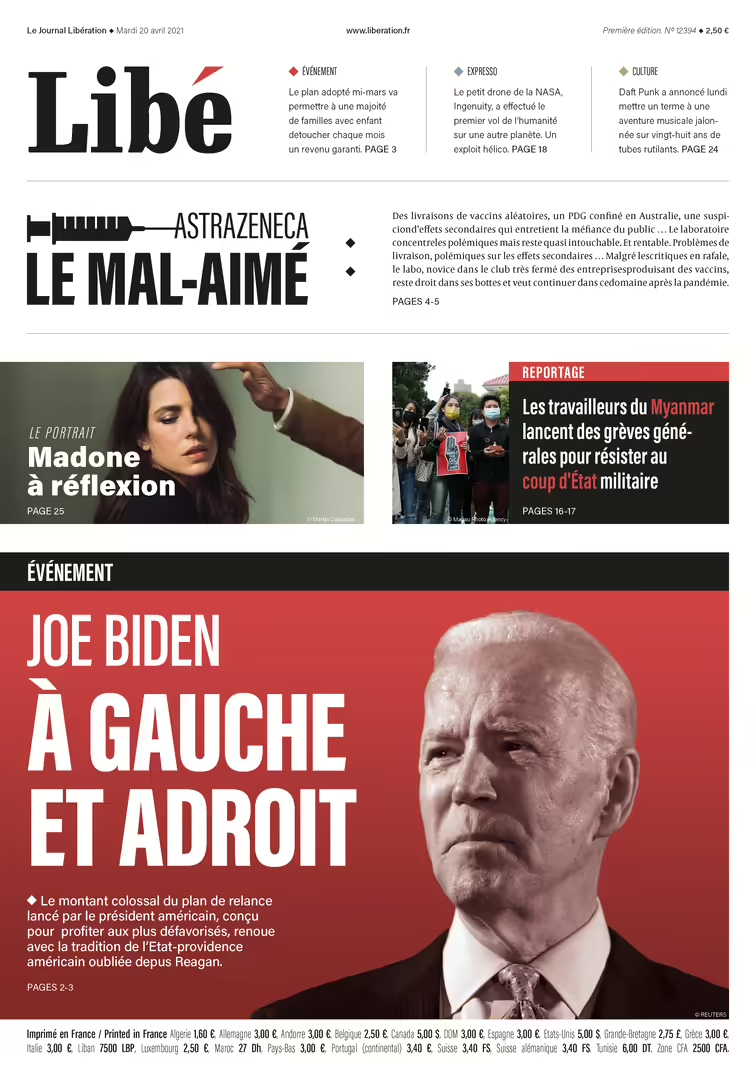
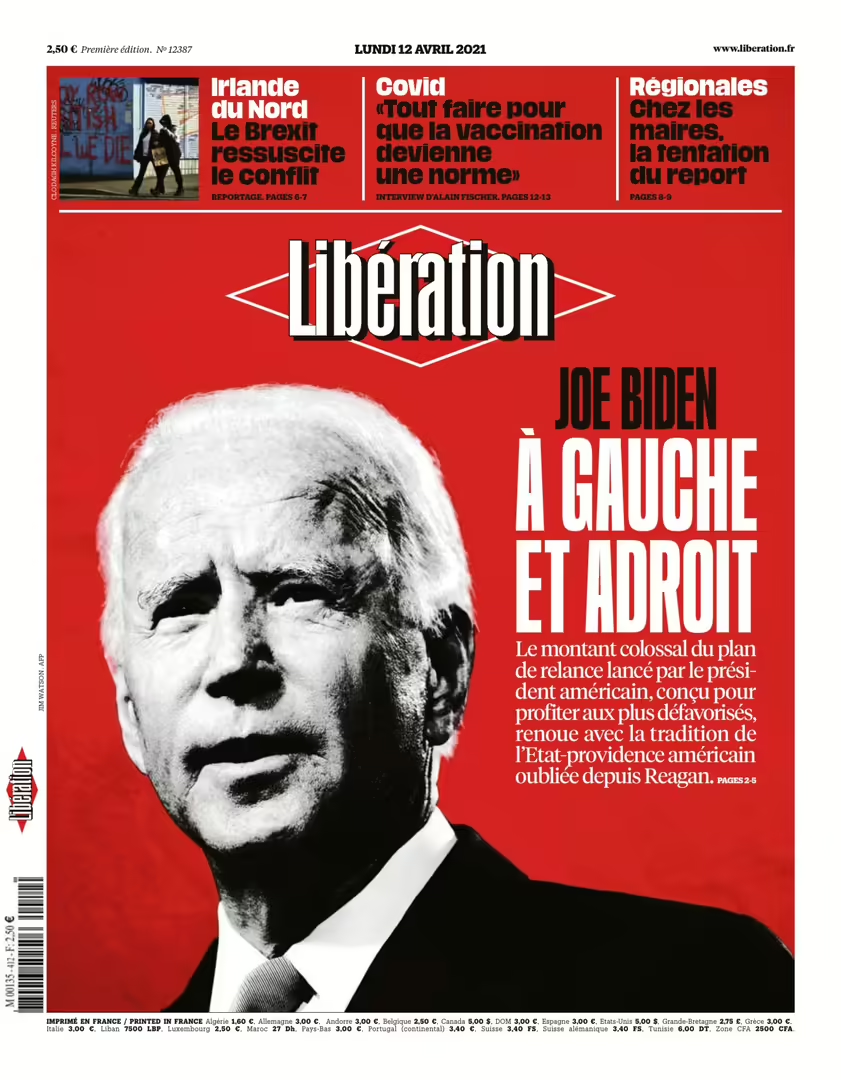
The biggest challenge of this project was that I wanted to redesign the French daily newspaper Libération. Working with a different language with a different typography was a learning experience. In the redesign of the logo, I chose to go for the name Libé as it is commonly referred to among readers.
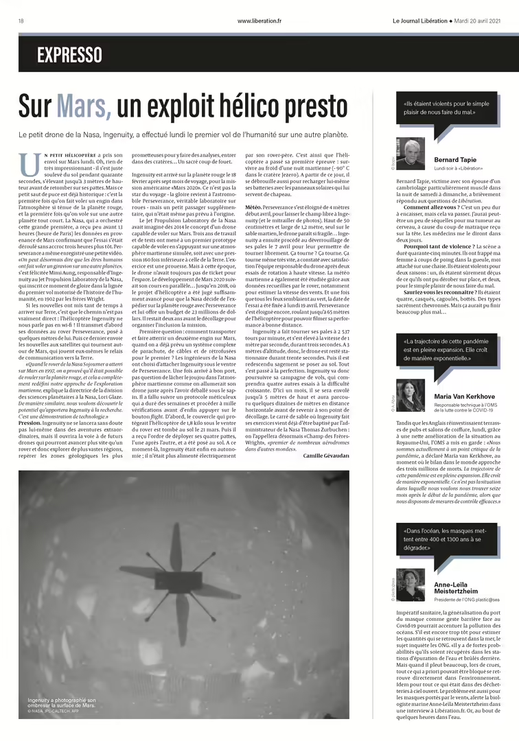
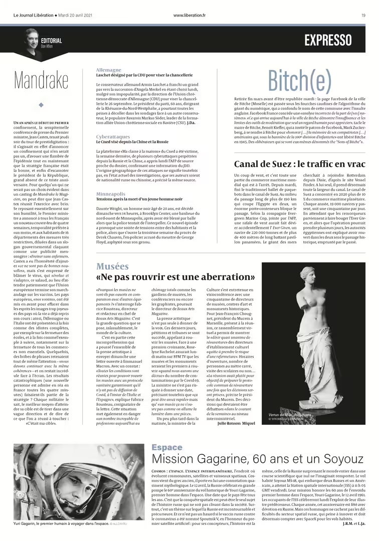
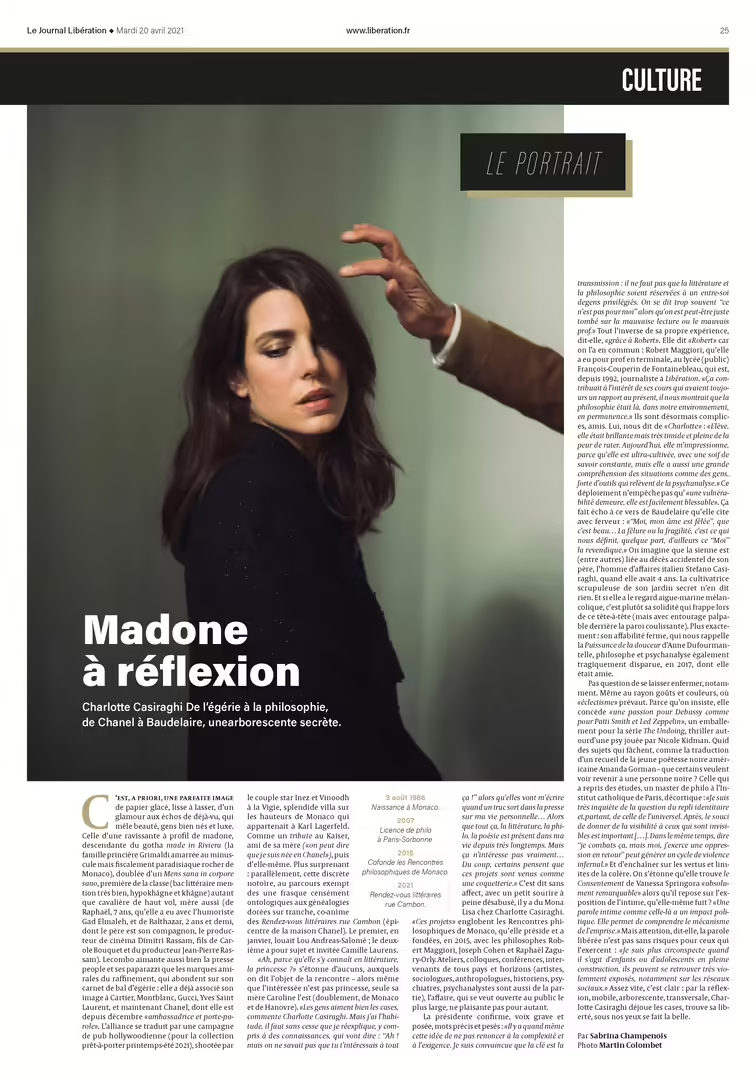
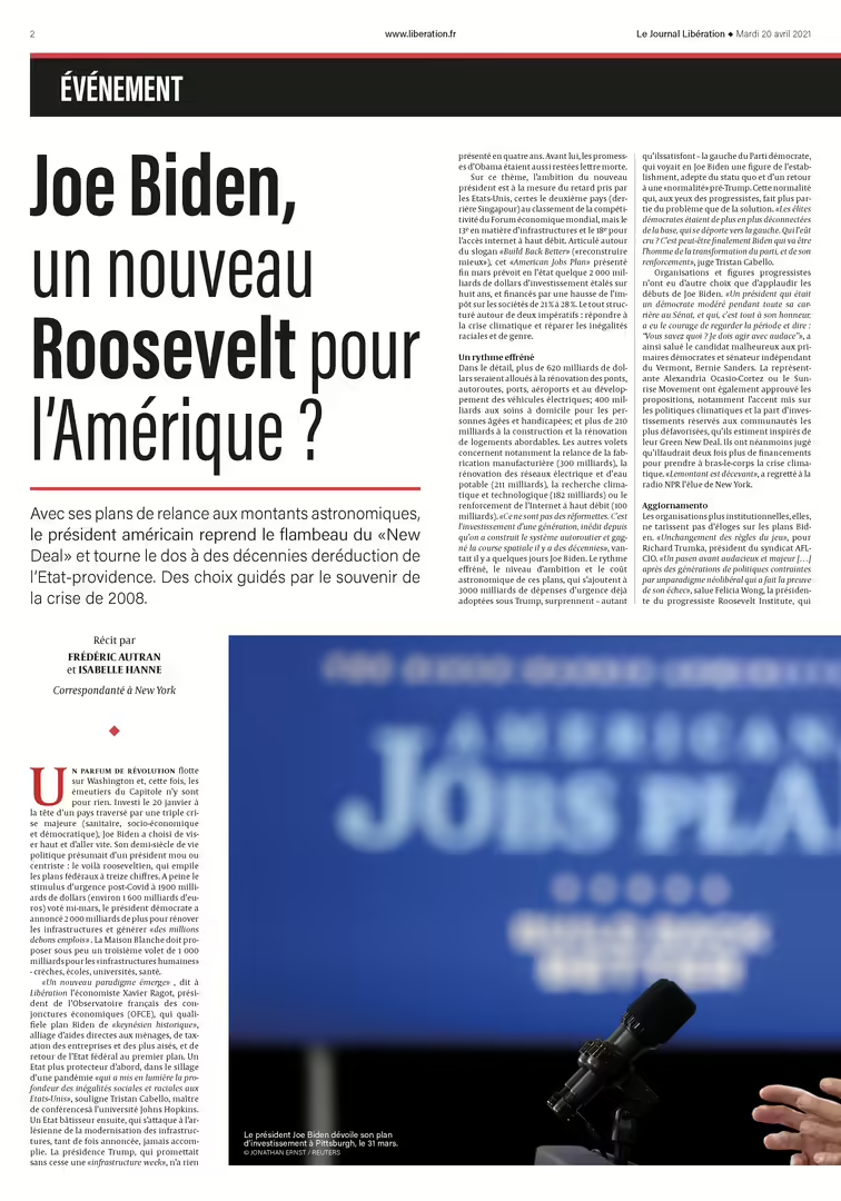
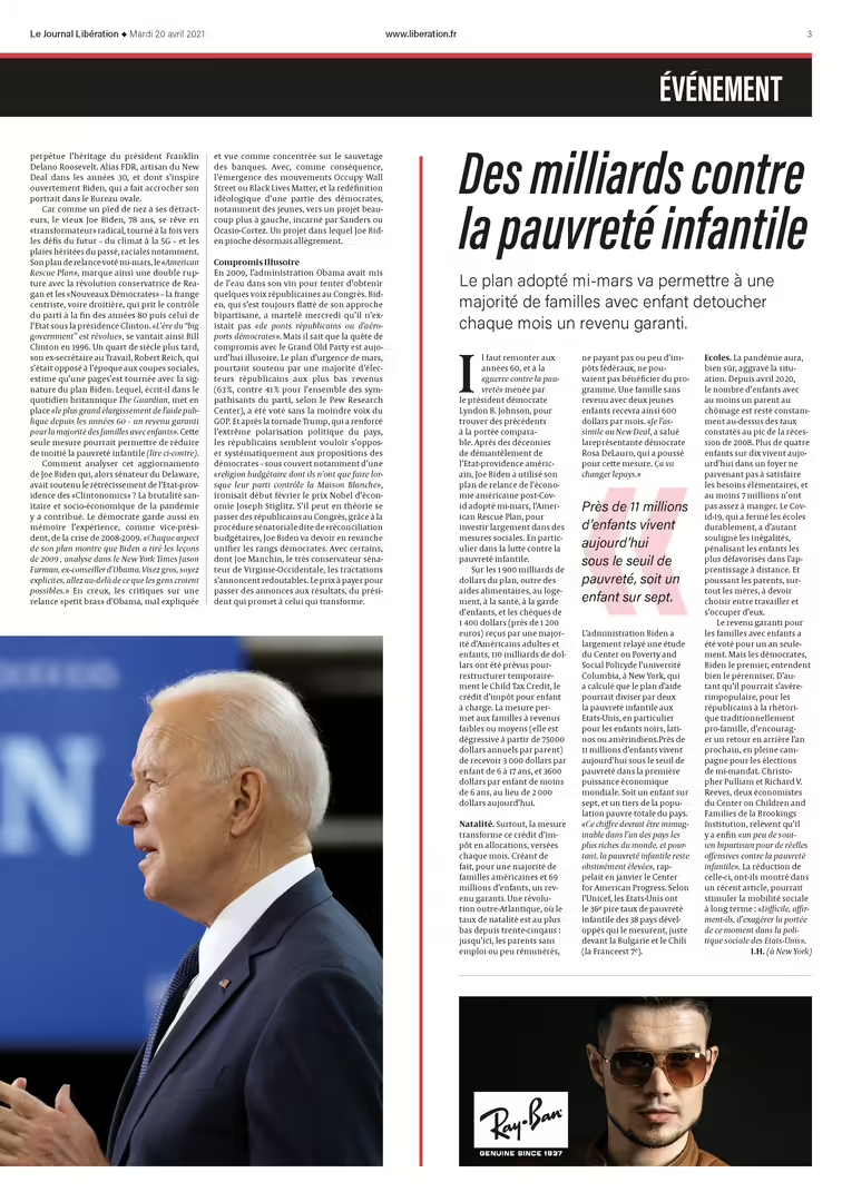
Each section of the newspaper has its own corresponding color to create a better overview of the content. The surfaces are designed with columns and index lines.
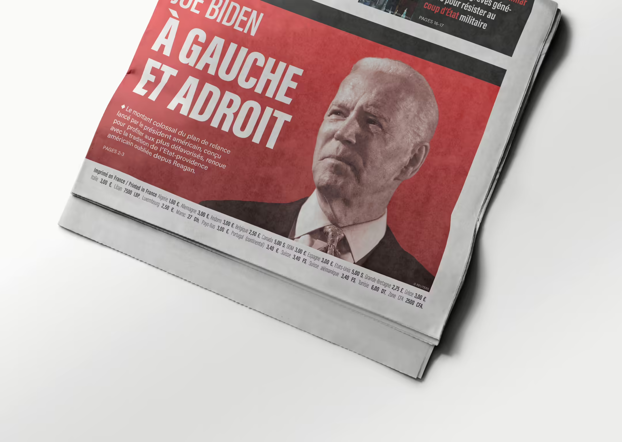
On the front page, I have chosen to go for an expression where the heaviest elements are placed at the bottom and lighter elements are placed above. This creates a lot of air at the top of the page. Air is an important tool in my newspaper, which is reflected in all the spreads.
Typography
Capitolium News 2 designed by Gerard Unger is the typeface that has been selected for this project. This is a typeface designed for newspapers and was therefore well suited for this purpose. The font is mainly used in the body text, but also in headlines and preambles.
In addition, the font Acumin is also used in the newspaper. Here I have chosen to use two different variants in the font family, the standard variant and extra condensed. Extra condensed is very suitable for large headlines where you want to use a large font size without taking up too much space.
Colors
Each section of the newspaper is divided into a unique theme color. The main color for the newspaper is red, a politically oriented color that is reused from the original, with small changes. This color is used for major news stories and politically oriented sections.
The newspaper also has an “express section” that deals with smaller issues, as well as editorials and comments. This section is intended to have a calm reading rhythm, and I have therefore chosen that all photographs in this section should be in black and white, so that the reader is not distracted by many colors. The Express section therefore uses a calm blue color that is not very distracting.
The culture section should be a little more exciting with creatively designed articles and freer layout of issues. A dark and desaturated yellow with a hint of gold is used in this section and stands out well from the rest of the color palette.
