Book series
Idea and concept
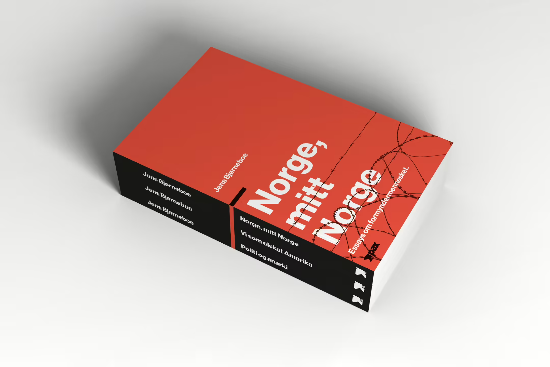
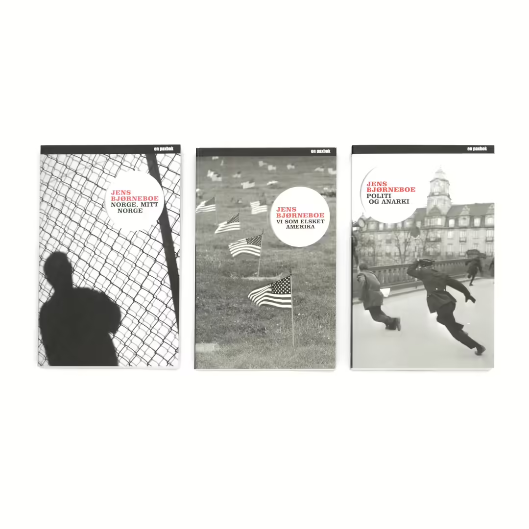
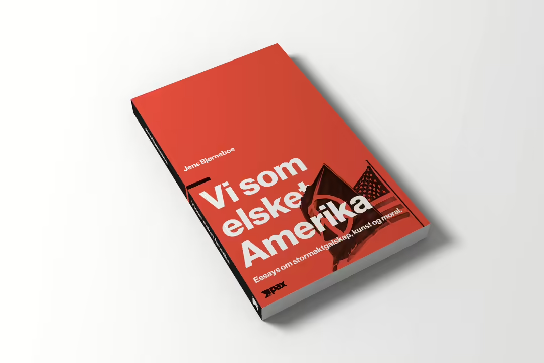
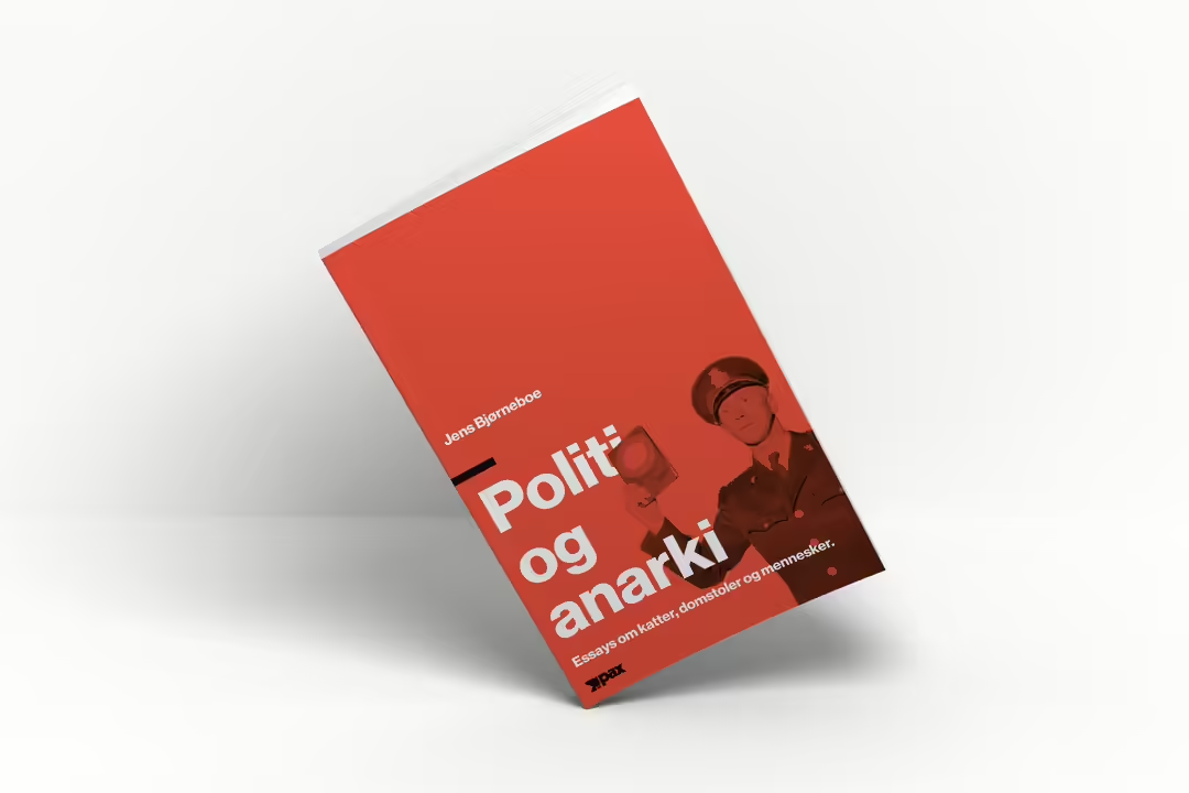
In carrying out this project, I chose to work with Jens Bjørneboe's essay trilogy - first published in the years 1968-1972. The style is inspired by international typography, which was a radical style that characterized the design environment in the 1950s in Switzerland. Both the use of color and the style are well suited to Bjørneboe's radical political views expressed in his essays. The surface is designed in a grid system, and archival photos have been used on each of the covers.


Typography
Neue Haas Grotesk is the only font I have chosen to use in this project. This font was widely used in Swiss typography and is the original font that Helvetica is based on. I have used the display variant for the title, subtitle and author's name, and the text variant for the body text on the back.

Graphical layout
A grid system is the basis for the structure of the book cover, a feature that was common in this style. It gives the book a tidier layout, but it also limits a lot of the freedom you have on the layout. I also wanted the design on the front cover to have a lot of air at the top, so I chose not to place any kind of elements there.

Color
The color was chosen in accordance with the regular use of red as a background color in Swiss typography. This color also has a political aspect to it, which in itself fits well with Bjørneboe's radical political views in the books.

