The Martian
Idea and concept
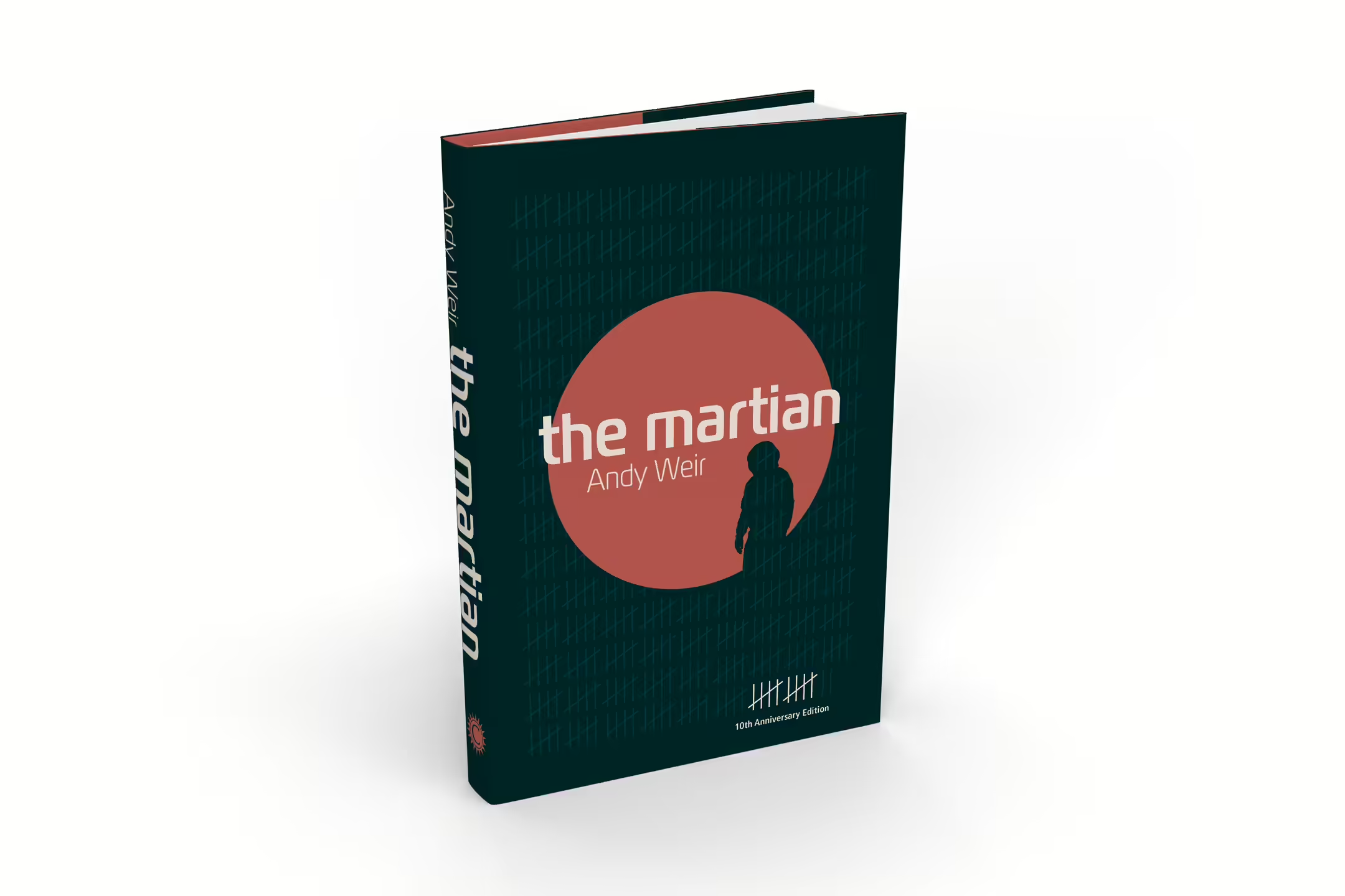
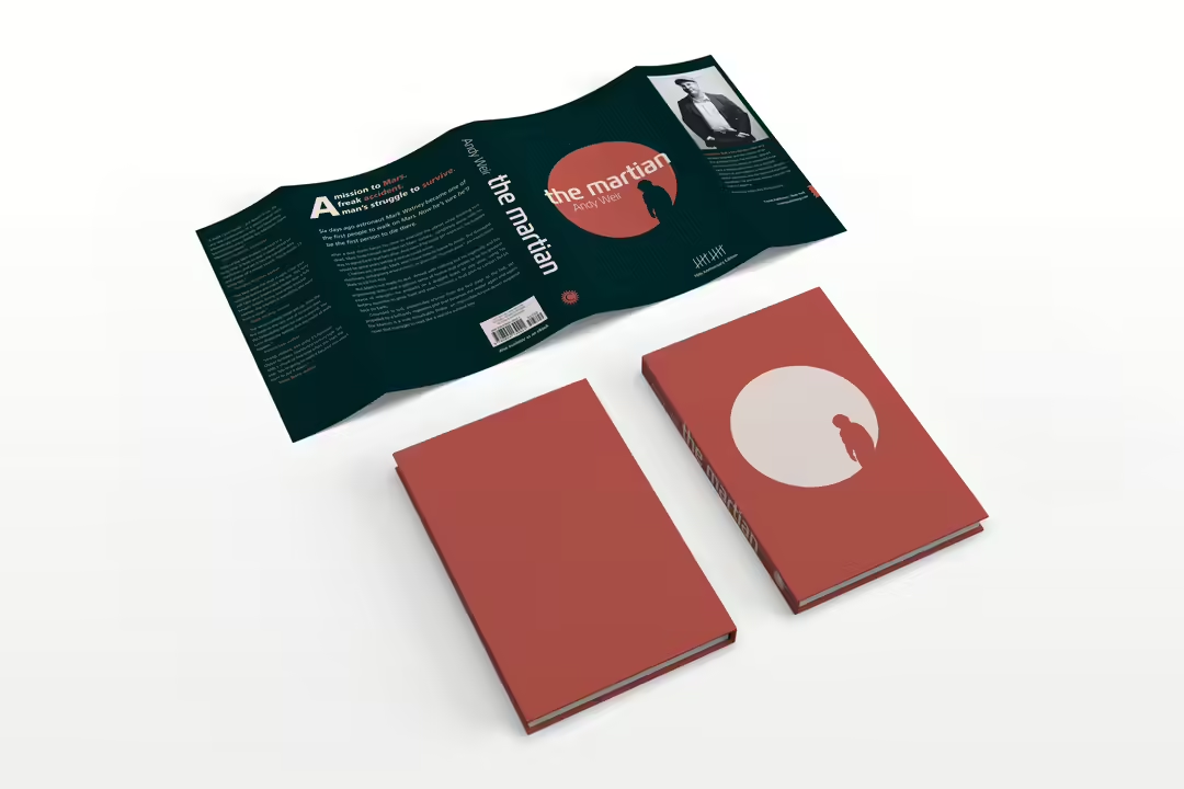
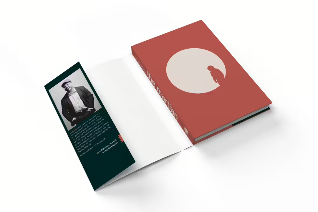
The background to this project was to mark the novel's 10th anniversary (since its publication under its own publisher in 2011) by launching a new edition with a redesigned cover and interior. This anniversary edition was to include a hardcover dust jacket in a hardcover spread. The summary on the back of the book would be the same as the original. Because it would be a dust jacket, there would also be information about the author and reviews on the flaps of the dust jacket. The matter, including the colophon, was to be redesigned and re-covered with new typography. The type of paper for the dust jacket, material and front cover would also be defined.
Colors
The color scheme for this project was a bit out of the ordinary for the genre. I took inspiration from other redesigns of the same cover, and almost all of them used saturated shades of orange, which I also did in my first draft. During development, I discarded these and decided to use dark shades of green (which can be associated with the organic element of the novel) and a darker variant of orange, as well as a desaturated red to replace white on the entire cover. The orange color is also used on the cover and as a paper color on the front cover.
Typography
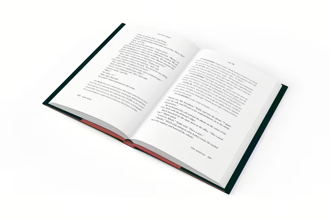
Typography was an important part of this project, especially when it came to the body text of the material. In the process work, a large exploration of fonts was carried out, where I took 16 different font families as a starting point and compared them based on criteria such as: Readability, a balanced gray effect on the text surface, and support for real chapters and minuscule numbers. After many trials, I finally decided that the Sabon typeface - designed by Jan Tschichold - was a clear winner.
Frutiger is used as a support font for Sabon, as they fit perfectly together. This font is also used as body text in some parts of the material, where it has a semantic connection with the content of the text.